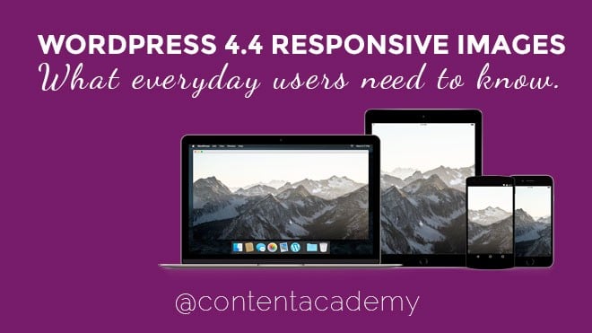
If you have ever tried to load a website on a mobile device with very large “high-res” images, you have probably noticed a lag in how long it took to load the page. To save bandwidth and combat long loading times, web browsers are starting to provide special tools that allow website developers specify which image to load based on the type and size of the screen.
While specifying certain variables depending on what browser or devices is nothing new, the process for implementing this sitewide for images in WordPress was a bit more challenging. For Joe McGill, enabling responsive images in WordPress core was a must.
“As of today, the average web page currently weighs over 2 MB with the majority of those bytes being attributed to images. Screen density and display sizes continue to increase and site owners are including larger image assets to keep up, causing slower page load times for people on smaller/older devices and on slower/expensive network connections. We have the opportunity to make a huge impact on the ~25% of the web that runs on WordPress by adding responsive image support out of the box so sites can serve appropriate sizes images to all users.” said McGill on the Make.WordPress site.
McGill’s quest to provide responsive image handling in WordPress originally started with a plugin. With the release of WordPress 4.4, this feature is now part of the core software incorporating this much-needed benefit to the open source program.
The benefits of Responsive Images seem really great, I’m an everyday WordPress user/blogger, what do I need to do?
Nothing!
There’s no configuration needed, WordPress will automatically implement Responsive Images given the image meets correct size and proportion. WordPress now utilizes the HTML source set {srcset} attribute to provide the browser with the best size image available.
When a user uploads a photo to insert into a post or page, WordPress creates 3 to 4 sizes and inserts them onto the server. You may have even noticed this before in the photo editor where it allows you to select a thumbnail, small, medium, large or full-size. What’s happening now, responsive images are pulling from one of these sizes to load the smallest size possible.
What Responsive Images doesn’t do:
For the most part, users can not select different images based on the type of screen. Responsive Images will pull one of the different versions of the same image to reduce bandwidth.
What about all of the images already on my site?
The new Responsive Images is retroactive, so all images should pretty much work automatically. Users can pretty much just continue to use WordPress as they were but keep the following tips in mind:
- Make sure to scale down the image you upload into WordPress to a respectable web friendly image size
- Utilize Jetpack’s Photon service to speed up the delivery of images, which now also supports the new responsive images.
- Read this post on Six tips for working with Images

Very good to know!