#BloggingTips
Maximize your blog’s images
by minimizing the pixel count

By: Scott Winterroth
March 11, 2019
Optimize your images to generate high performing posts and pages.
In my last post, Sources for great photography content and how to use them on your blog properly, I introduced my Back to Basics series which includes ideas, instruction and updated resources for creating your best content – regardless of how many years you have been at it.
I shared how critical images are to telling your story with resources for where you can download stock photos and lesser-known images sources
This post is a continuation of my mini-series on working with media and photography.
Let’s talk about the process of properly working with images from after you select a photo and to the insertion into your content.
Stick around to the very end of the post where I share bonus tips for optimization the delivery of photos with free and low-cost CDN resources.
Listen to this post here:
What you will find in this Post:
- Select the appropriate media file-type based on the end use application
- What size should my blog images be?
- From your camera to your content, best practices for optimizing your images.
- Optimizing the Delivery of Images
Estimated Reading Time
- 14 minutes
- Contains approx. 2,663 words
TL;DR – Listen to this post on my podcast:
Why optimize your blog’s images?
My loyal followers know that I’m a WordPress guy. And I’m not talking about the free WordPress.com platform. While WordPress.com is an excellent platform, I support open source and work primarily with the self-hosted version of WordPress. This version requires me to maintain WordPress on a web hosting service.
When you operate a self-hosted blog or website with WordPress, you can scale your site to meet your exact growth needs. But this can come at a cost especially if you ignore small details such as your image workflow.
With the self-hosted version of WordPress, I can custom build anything I desire, but the tradeoff is I have to maintain everything I build and consider the implication of whatever I upload on my hosting server whether that is a plugin, themes or media images.
Because when running a self-hosted WP website I’m not only responsible for managing the WordPress install and your blog content, but the server resources for which it operates on.
It’s sort of similar to your mobile phone, you know when you maybe take too many pics, or you install a few too many apps, the storage gets full, and the phone sometimes works harder, and your battery dies faster, or you have to pay for more room. The same can apply to your blog’s hosting account.
The more space and bandwidth I use on my hosting server with additional bulky high-resolution images, the more resources it will consume. Eventually, maybe even to the point where I will have to pay for those extra resources or upgrade my hosting.
Not to mention, unusually slow websites can also diminish your search rankings. In my mind, the fewer resources I use, the better of the world will be. Everyone should optimize images, but if you have a small website with just a few pages and pictures, you’re probably okay. When you begin to scale your content strategy and start posting regularly to your blog, and you begin to attract a decent amount of traffic, then you run into growth problems. These can include with bandwidth overages, CPU Cycles limits and an overall hits to your pocketbook.
Before you upload your next image, consider this:
It’s not a good idea to upload full-resolution photos from your phone or camera directly to your WordPress website. This will cause bandwidth problems as well as take up a lot of space on your hosting server. Something I’ve experienced first hand over my years with blogging.
Regardless of the platform you use, it is a best practice to convert images and graphics into the appropriate file type and size before you upload them directly into your site. Some platforms will even tell you if the image is too large and you need to scale it down before you’re able to use it.
Here’s how I go about managing my blog’s image workflow to maximize my storytelling impact while minimizing my site load resources and hits to my pocketbook.
Video Tutorial: Image Types Explained
1. Select the appropriate media file-type based on the end use application
There are three main types of media file extensions for images – GIF, PNG, and king JPG. You’re probably somewhat familiar with these extensions as they have been around for a long time and used on many of the devices you use every day.
Which media type you choose for your blog’s images impact on the image quality and site load time. Let’s review each file type for when you might want to use one over the other.
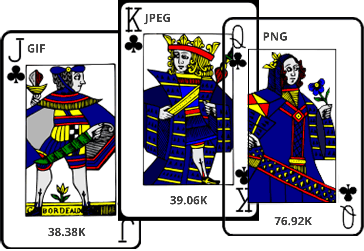
Gif
GIF (jiff) is a media format that supports both transparency and animation and is popular for banner advertisements, simple animated site elements, and memes where maybe one or two frames animate to create a fanned index card “flip book” animation effect.
In web development, we sometimes use GIF in replacement of larger video files to create an animated video background or element where large video files don’t make sense. Large GIFs can be rather resourced intensive because it often is the compilation of several photos to create a flipbook-like sequence. It’s a cool effect but it can come at a cost.
PNG
A PNG is a media format that supports transparency. Meaning whatever is behind the image or graphic will show through. This format is ideal for logos, cutouts and other types of graphics that need to show transparency because they are not a standard rectangle or square.
PNG provides the ability to create transparency, but they cannot compress to the smallest size possible. That’s why the next media type is the king of the digital photo formats.
Jpg
A JPEG is popular among most media types as it provides the most image compression but does not support transparency but does support lossy. Meaning the image file can appear to be rather large but not bulky and not take up a lot of space. JPEGs are sometimes not ideal for a logo or graphics unless you can match the background color of the image to the background color of its final application. It is suitable for images that accompany a blog post or a featured image where they are almost always naturally rectangle, and the application doesn’t require transparency.
When possible use jpeg because it provides the most compression, be careful to not overly compress your photos to a point where they start to look grainy.
Images are powerful tools to help tell your story, but sometimes the medium is also the message. If your photo is gross, then it will distract from the message. For excellent image sources for your blog, be sure to check out Sources for great photography content and how to use them on your blog properly for a complete guide to finding images for your blog.
2. What size should my blog images be?
Images are measured essentially two way, by pixels and by file size. The more pixels, generally means the more significant the image file size. When it comes to the web, we want the best looking photos at their smallest possible file size. To answer what is the ideal photo size for your blog’s images is hard because it depends on the application and the file format needs. My rule of thumb is the smallest size possible without degrading the image clarity.
What are pixels?
My computer’s dictionary defines pixels as a minute area of illumination on a display screen, one of many from which an image is composed. If we think of pixels, we must consider that our devices screens are made up of thousands of bright pixels. A high resolution 13’ Macbook with Retina display has the capability to display 2,560 x 1,600 at 232 pixels per inch (PPI).
According to unitconverters.net, one inch is about 96 pixels; the average laptop screen is probably around 14’ which is approximately 1,344 pixels in standard definition.
My iPhone 6S’s back facing camera takes high-resolution photos at about 4032 x 3024 px at 72 PPI, creating a 2.3 MB JPG file at a whopping 42 in by 31 in. We want to take photos in high resolution in the event we decide to print that photo as printers work similar to pixels, except they are trying to figure out how much ink the images will require to spread across the paper. You may be familiar or remember DPI, or dots per square inch. Similar but different to PPI.
Let’s compare pixels to pixels here…
If you compare the numbers, the photo I took with my camera is almost double the size of the screen of my computer. Most websites fit within the screen of my computer. Therefore, images that I upload and use on my blog do not need to be any larger pixel-wise than the size of my screen.
In reality, unless the images will be used as a full-screen background or for a large image slider or something similar, then most photos can be comfortably reduced down by 50% or smaller. When it comes to adding images to blog post content, most blog posts layouts are about 600-1200 pixels wide, at their max on a desktop. For an image that accompanies a blog post. It might only need to be, at max, 600px wide to fit with the post’s content container.
3. From your camera to your content, best practices for optimizing your images.
I hope I’ve made a compelling case for why you need to optimize your images before you upload them into your blog or website, but now I want to transition into how you might go about doing that.
Some stock photography sites like Pexels or Pixabay will let you download a right-sized image, which is good. I’m glad they do this; it can help save a step.
Other stock sites only offer one size or if you took a photo with your phone or camera. If you download the high-resolution image from either a stock site or from a device or camera – or even a screenshot for that matter – it’s best to open the asset up in a photo editing tool like Adobe Photoshop to resize the image and save for web.
Once I open the photo up in Photoshop, I will go to edit the image size to reduce the image to an appropriate size for it’s an application. Probably no bigger than 1200 px wide. Then I go to File, Export, Save For Web and optimize even further by selecting the appropriate file type and compression ratio.
To download a step-by-step cheat sheet on how to properly reduce the size of your images in Photoshop, visit blogyouwant.com/39.
When you’re exporting your images for the web from Adobe Photoshop or something similar, then I highly recommend determining a file naming process. Consider using a file naming process that makes it easy for you to find that photo by subject topic or whatever makes the most sense. When you’re searching on your computer or within the WordPress Media Library, you’ll want the file name to have some keyword that will trigger a search query. This will save you a lot of time and headache.
I wrote a very detailed blog post with ways to organize your computer and files for success. I’ll add a link in show notes so you can read up on my best practices.
Once the image is optimized, then I will head on over to my WordPress site and upload into the post, page or media library and try to fill out as much of the meta information as possible including file name, description, caption (if needed) and alternative text. Depending on your theme, some of this meta information will show along with your image so be sure to test them out and know which ones do what.
Write descriptions that explain what the photo is about, almost as if you had to explain this photo to someone who couldn’t physically see it. That is what the alt-text field is for, to help screen readers interpret a picture to a user with visual disabilities.
Optimizing for Accessibility
When you leave this information blank, and a user requests to read the image the computer will reply with something like IMG_1222 rather than appropriately saying something like a green cup in the center of a brown table. You’re listening to this podcast; I bet you can imagine a green cup on a brown table. That is what the alt text provides for users who can not see the actual photo.
4. Optimizing the Delivery of Images
Once the images are within your WordPress media library and displaying on your site, there are still some things to consider for optimizing your blog’s images. The first and most common image optimization technique is to deliver media from a different server. Typically, this is what we call CDN hosting which a CDN is a server designed for delivery of media downloads over a content delivery network (CDN).
Basic CDN can be pretty costly and sometimes overkill if you’re just getting started so that is why I recommend a free image optimization feature you might even already have installed on your WordPress blog.
Maximizing your image delivery with JetPack
JetPack has a fantastic free feature called Site Accelerator, which takes your images and serves them from super fast servers. I’m not sure how or why they do this, but it saves some big bucks and headache from trying to configure and manage your CDN. So be sure to installed and activate JetPack from Automattic and turn on the site optimization features for images and maybe other features if they work for you.
What if you have a ton of images in your blog already that are not optimized or you have multiple users, and they are not optimizing images?
If you’ve been uploading images over the years and not optimizing them or others other creators on your site and they are uploading their images, there are a couple of WordPress plugins and other image optimization services that will reduce and optimize the size of images after they are uploaded into your media library. I’m not a big fan of this because I’m 100% behind optimizing your images before you even upload them. But if you have a site with many images that are not already optimized or you have multiple users
Sometimes you can’t control what others are doing to plugins like Imagify.io and Smush It is services that provide plugins to optimize your images already within your website. If you use SiteGround WordPress Hosting, they also offer server-side image optimization, and you can optimize images from the SG Optimizer plugin as part of your plan. This is what I use for post upload image optimization, and it works great.
Speed Testing with Pingdom Speed Test
Ok, finally, my last tip for optimizing images on your site. To make sure all of your efforts don’t go unnoticed, you probably want to test your website for page load speed. I like to use the free speed testing tool called Pingdom Website Speed Test. A link is in the show notes.
This website you can enter your URL, and it will provide you with a speed test report for your blog with some tips on how to continue to optimize your speed. I’m going to save this for another upcoming post, so please subscribe to this blog to get this topic and the rest of my tutorials and interviews delivered.
#getblogging!
Listen to my podcast at blogyouwant.com for more helpful blogging and content marketing tips.
What do you think of these examples? Does it help you become a more productive content creator? What would you like to see?